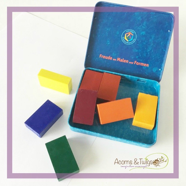
These are the colors laid out in every waldorf kindergarten and are the first given to the youngest school children.
It consists of the following STOCKMAR block crayon colors:
- 01 Carmine Red
- 02 Vermilion
- 03 Orange
- 04 Golden Yellow
- 05 Lemon Yellow
- 07 Green
- 10 Ultramarine
- 12 Red Violet
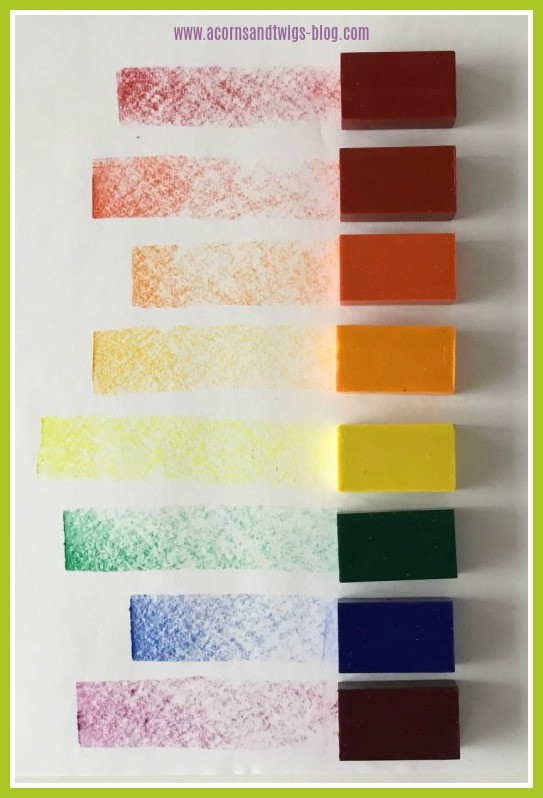
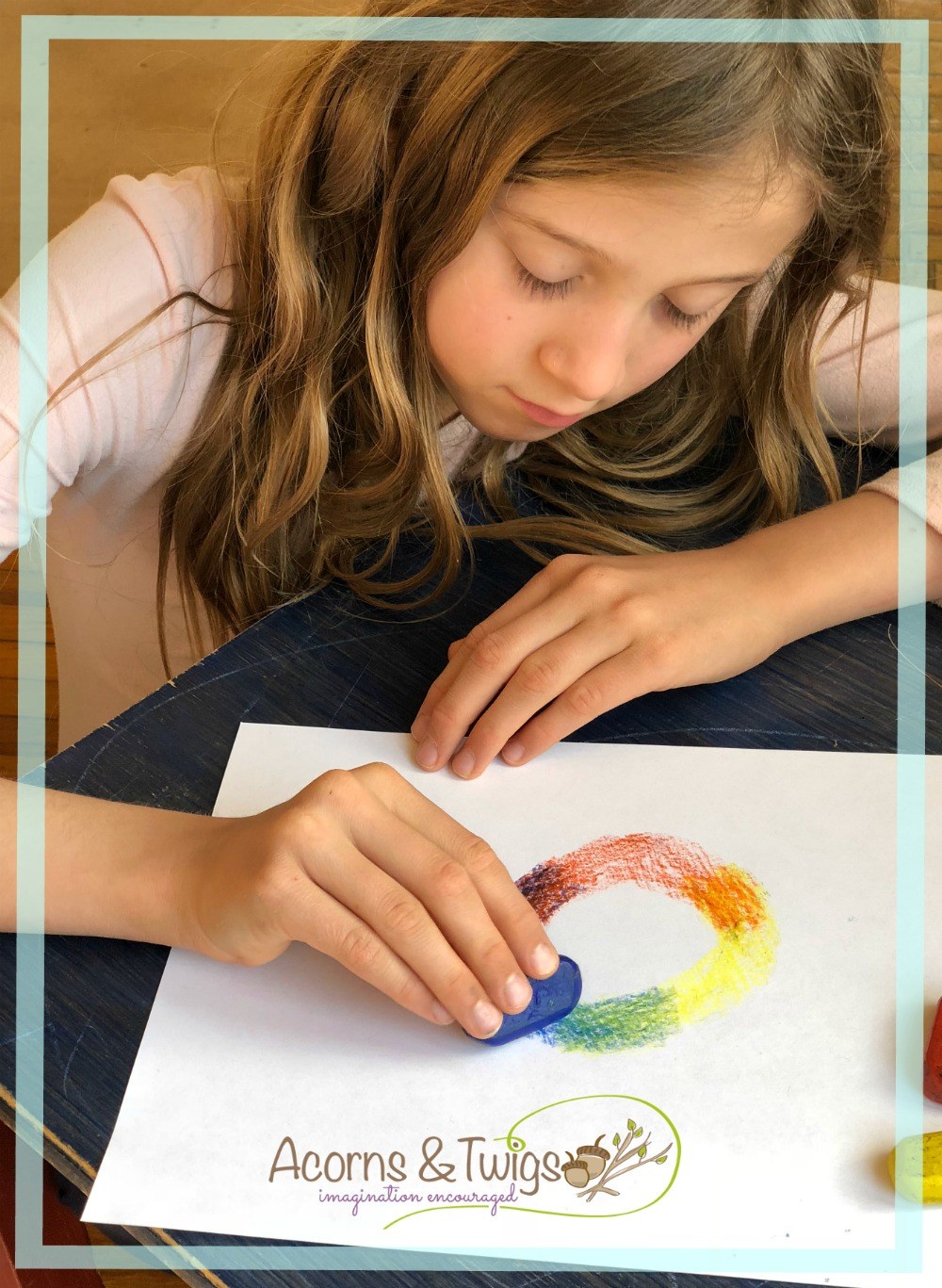
The purpose of this color selection is to encourage young artists to discover color on their own, by layering and blending the available colors to get the effect they are trying to achieve.
You might notice there is no black. As there is also no pink, gold, white or brown. In fact there are no “earthy” tones. These are the colors of the rainbow.
According to anthroposophical belief, of which Waldorf education is based, colors have spiritual powers & meanings. This is especially important in respect of a child in it’s first seven years of life - a time when the child has not completed its incarnation and is still very connected to its spiritual heritage.
A child who has not yet changed its teeth is much more susceptible in general and is consequently more sensitive to colors. Colors influence our moods greatly, and children even more so.
Lectures from Waldorf's Founder
The following paraphrases originate from Rudolf Steiner’s, founder of waldorf education, lectures on the arts and color:

" Black is the color of spiritual death." — THE ARTS AND THEIR MISSION (Anthroposophic Press, 1964), p. 94.
"Black represents lifelessness; it is destructive, fatal darkness." — COLOUR (Rudolf Steiner Publishing Co., 1935), lecture 1, GA 291.
"Black is a pictorial color; it takes its hue from things outside itself." — COLOUR (Rudolf Steiner Publishing Co., 1935), lecture 2, GA 291.
Confused with all the STOCKMAR Set options?
I've created an overview comparison chart of all the different pre-packaged crayon sets available from STOCKMAR.
Tell us your best e-mail address where we can send you a free PDF download to finally cut the overwhelm!

Steiner never suggested taking the black colors away from children in any of his lectures on education, as some experts claim. This assumption of a prohibition on the use of black in drawing and clothing cannot be found in any of his education lectures. He himself wore black most nearly everyday, even when he was visiting the children in his school.
Steiner did have plenty to say about appropriate colors for each of the developmental stages a person goes through during life. Van James wrote in an article “Color in the Waldorf School”:
If we look into a Waldorf school classroom we see the deliberate and consciously considered use of color. Although not every Waldorf school is exactly the same in its choice of colors there is often a general consistency based on a response to the stages of child development.
For instance, in the nursery, kindergarten, and early grades, a soft, warm, pink tone is usually selected for walls and curtains because of its gently active and supportive quality. Pink is a loving, innocent color, decidedly feminine in character. Therefore, it is a natural color choice for the daily embracing of this age group.
The Waldorf classroom colors evolve from these warm, reddish tones in the early grades, through energetic orange/yellow around third grade, into the middle spectrum greens around fourth and fifth grade. It is here at the half-way-point of childhood that a kind of balance is achieved just before the onset of puberty. Green is the balanced color between light and darkness, and meets this age group in a harmonious way. From sixth grade on into the high school, various shades of blue dominate, and even lavender, lilac, and violet tones are indicated for the more inwardly active, thoughtful work of the upper school adolescent. However, craft rooms are often appropriately painted with warm colors, and spaces for eating are aided by appetite sympathetic golden-orange colors.
The interior colors in a Waldorf school are meant to support the child’s general phase of development at the same time as to enhance the educational experience for the particular grade level. Each classroom is a unique space for a specific age group and its activities. Therefore, each classroom wears a color appropriate to that space, the age of the students, and what generally takes place in it."
You will probably never find a baby nursery designed in black. Most clothes and accessories for babies are pastel colors and a toddler will tend to grasp a brightly colorful toy first. We simply have a natural avoidance of black when it comes to young children.
Is that a reason to remove the black from your child’s art supplies?
Some Waldorf enthusiast believe so.
I personally have found two acceptable options:
- Include the black crayon with all the other accessible colors. Not making a big fuss about it and driving more attention to it. If a child tends to turn to the black excessively, that would be an important insight I would want to have. It would lead me to questions and to observe the child’s other behaviors, giving me an idea of its inner soul’s needs.

If the black starts to dominate, leaving the other colors ignored then I would suggest taking the black away for a while “forcing” the child to experiment with other colors.
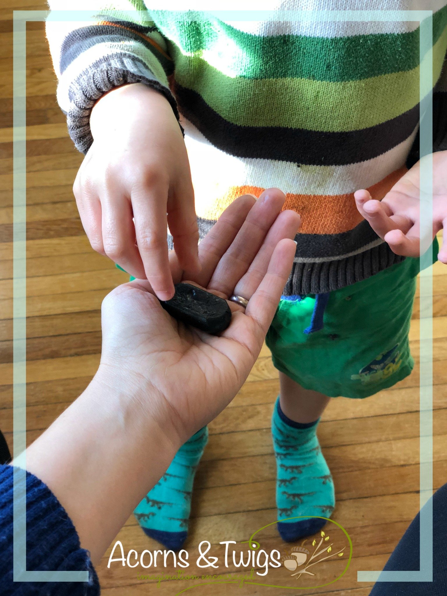
- My personal choice is to keep the black (and other “special” colors, such as gold, silver, pink, gray etc.) in my cupboard, out of my children’s reach. My children are aware that we have them and if they ask for it, I willingly hand it out. That way it is not an obvious first choice but a deliberate consideration and I keep control of it.
I believe black is an essential color and shouldn’t be missed when drawing the black stripes on a zebra or the tires of a tractor.
The truth is, black is a part of our nature and we can not and should not deny that.


